The xts package is fantastic for time-series data manipulation. You can easily convert to and apply functions to different frequencies, merge with other time series vertically and horizontally, and lag data. These are very helpful features that are cumbersome when working with a data.frame. Unfortunately, if you want to leverage ggplot to produce great looking plots, you cannot use xts objects natively.
It is fairly easy to convert from xts to to a data frame but the key is to get the date into its own column.
library(xts)
library(ggplot2)
library(ggthemes)
library(reshape2)

## Read in a csv file of prices
ibm_url = "http://real-chart.finance.yahoo.com/table.csv?s=IBM&g=d&a=0&b=1&c=2005&ignore=.csv"
ibm_price_hist = read.csv(ibm_url, header = T, quote = "")

## Convert the data into an xts object for ease of date manipulation.
x.ibm_price_hist = as.xts(ibm_price_hist[,-1], order.by = as.Date(ibm_price_hist[,1]))

x.ibm_price_hist_monthly = to.monthly(x.ibm_price_hist$Close, OHLC=F)
I don’t like those four steps to get the price data into an xts object, so just create a personal library function to handle it. You can use the quantmod package which includes a function (getSymbols) to download prices and other data from various sources directly into xts objects. You can also just roll your own.
GetPrices = function(url) {
  price_hist = read.csv(url, header = T, quote = "")
  ## Convert the data into an xts object for ease of date manipulation.
  x.price_hist = as.xts(price_hist[,-1], order.by = as.Date(price_hist[,1]))

  return(x.price_hist)
}

x.ibm_price_hist = GetPrices(ibm_url)

x.ibm_price_hist_monthly = to.monthly(x.ibm_price_hist$Close, indexAt = "endof", OHLC=F)
tail(x.ibm_price_hist_monthly)
## Close
## 2016-07-29 160.62
## 2016-08-31 158.88
## 2016-09-30 158.85
## 2016-10-31 153.69
## 2016-11-30 162.22
## 2016-12-06 160.35To use ggplot with this data, we need to convert it back to a data.frame. This is a fairly simple process, but again, we don’t want to continually do it so create a function.
xts2data.frame = function(x) {
  df = data.frame(x=index(x), coredata(x))
  # Preserve the column names from the xts object
  #  and use "Date" as the new column for new date column
  colnames(df) = c("Date", colnames(x))
  return(df)
}

df.ibm_price_history_monthly = xts2data.frame(x.ibm_price_hist_monthly)
tail(df.ibm_price_history_monthly)
## Date Close
## 139 2016-07-29 160.62
## 140 2016-08-31 158.88
## 141 2016-09-30 158.85
## 142 2016-10-31 153.69
## 143 2016-11-30 162.22
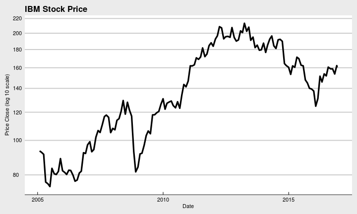
## 144 2016-12-06 160.35ggplot(df.ibm_price_history_monthly) +
geom_line(aes(x=Date, y=Close), size=1.5) +
ggtitle("IBM Stock Price") +
ylab("Price Close (log 10 scale)") +
scale_y_log10(breaks=pretty(df.ibm_price_history_monthly$Close)) +
theme_economist_white()
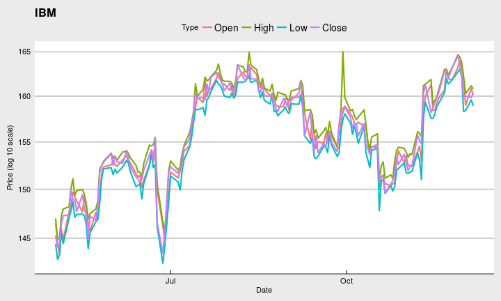
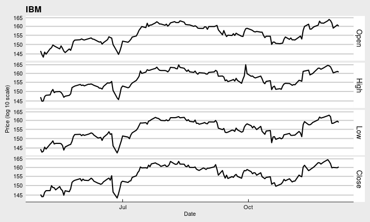
If you want to use the group or facet features of ggplot for each time series in your object, you will need to “stack” the data. There are many ways to do this, but melt from the reshape2 package does a good job.
df.ibm_price_history = xts2data.frame(x.ibm_price_hist["2016-05-01::"])
df.ibm_price_history_stack = melt(df.ibm_price_history[,1:5], id=c("Date"), variable.name="Type", value.name="Price")

ggplot(df.ibm_price_history_stack) +
  geom_line(aes(x=Date, y=Price, group=Type, color=Type), size=1) +
  ggtitle("IBM") +
  ylab("Price (log 10 scale)") +
  scale_y_log10(breaks=pretty(df.ibm_price_history_stack$Price)) +
  theme_economist_white()
ggplot(df.ibm_price_history_stack) +
  geom_line(aes(x=Date, y=Price), size=1) +
  ggtitle("IBM") +
  ylab("Price (log 10 scale)") +
  scale_y_log10(breaks=pretty(df.ibm_price_history_stack$Price)) +
  facet_grid(Type ~ .) +
  theme_economist_white()
Those are not very helpful charts, but you should get the idea.
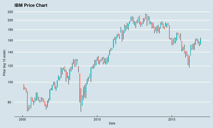
Here is a nice candlestick chart that looks much better and uses the data. It takes a little more data manipulation, but it is worth it.
x.ibm_ohlc_hist_monthly = to.monthly(x.ibm_price_hist$Close, indexAt = "endof", OHLC=T, name = c("Data"))
tail(x.ibm_ohlc_hist_monthly)
## Data.Open Data.High Data.Low Data.Close
## 2016-07-29 152.35 162.65 151.68 160.62
## 2016-08-31 161.45 163.53 158.32 158.88
## 2016-09-30 159.54 161.64 153.84 158.85
## 2016-10-31 157.61 157.61 149.63 153.69
## 2016-11-30 152.79 164.52 151.95 162.22
## 2016-12-06 159.82 160.35 159.82 160.35df.ibm_ohlc_hist_monthly = xts2data.frame(x.ibm_ohlc_hist_monthly)
# Need the direction
df.ibm_ohlc_hist_monthly$Direction = ifelse(df.ibm_ohlc_hist_monthly$Data.Close >= df.ibm_ohlc_hist_monthly$Data.Open, "UP", "DOWN")
ggplot(df.ibm_ohlc_hist_monthly) +
geom_linerange(aes(x=Date, ymin=Data.Low, ymax=Data.High), size=.5) +
geom_rect(aes(xmin = Date - 10, xmax = Date + 10, ymin = Data.Open, ymax = Data.Close, fill=Direction)) +
ggtitle("IBM Price Chart") +
ylab("Price (log 10 scale)") +
scale_y_log10(breaks=pretty(df.ibm_ohlc_hist_monthly$Data.Close)) +
theme_economist() +
theme(legend.position = "none")